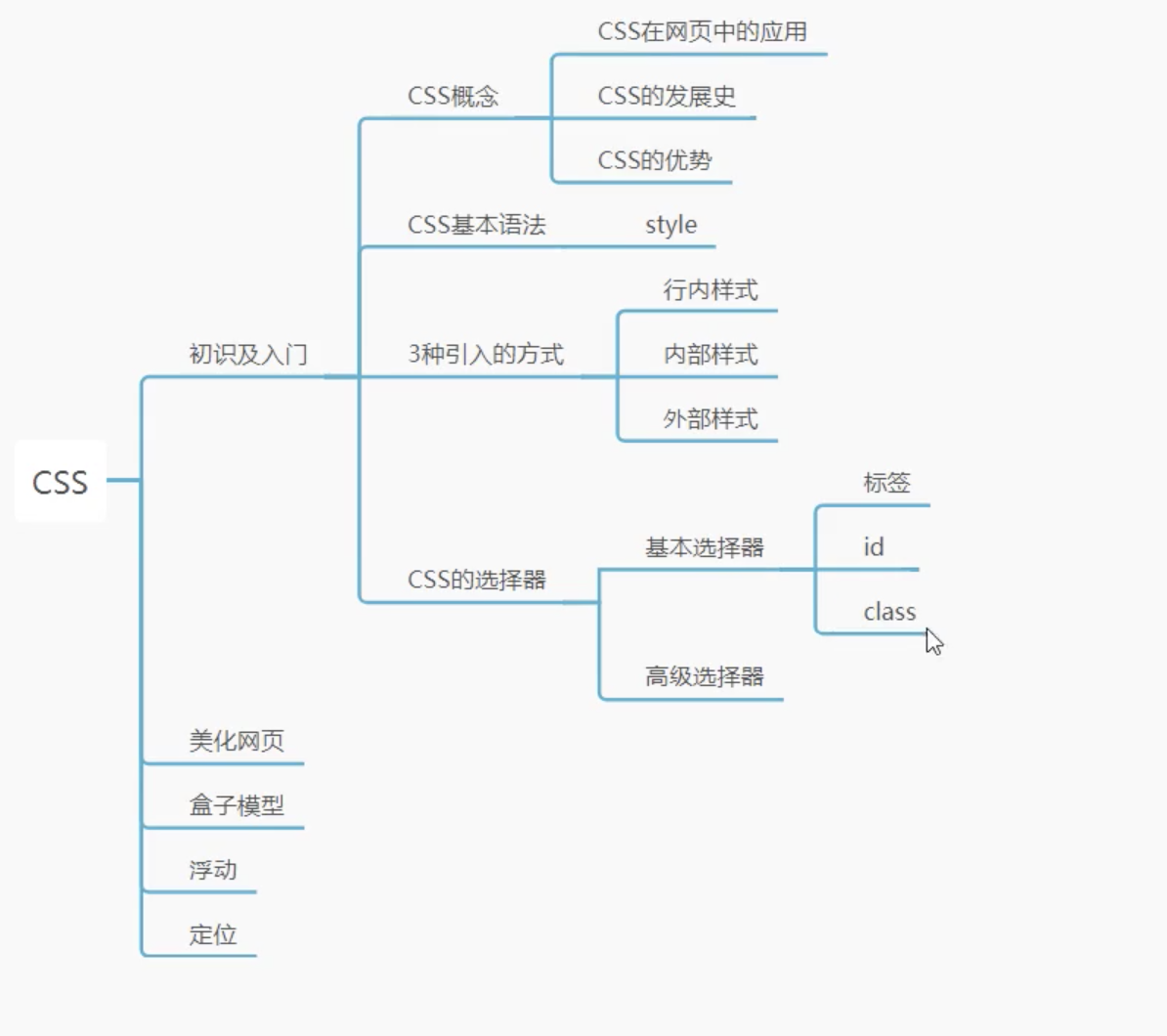
什么是CSS 如何学习
CSS是什么
CSS怎么用(快速入门)
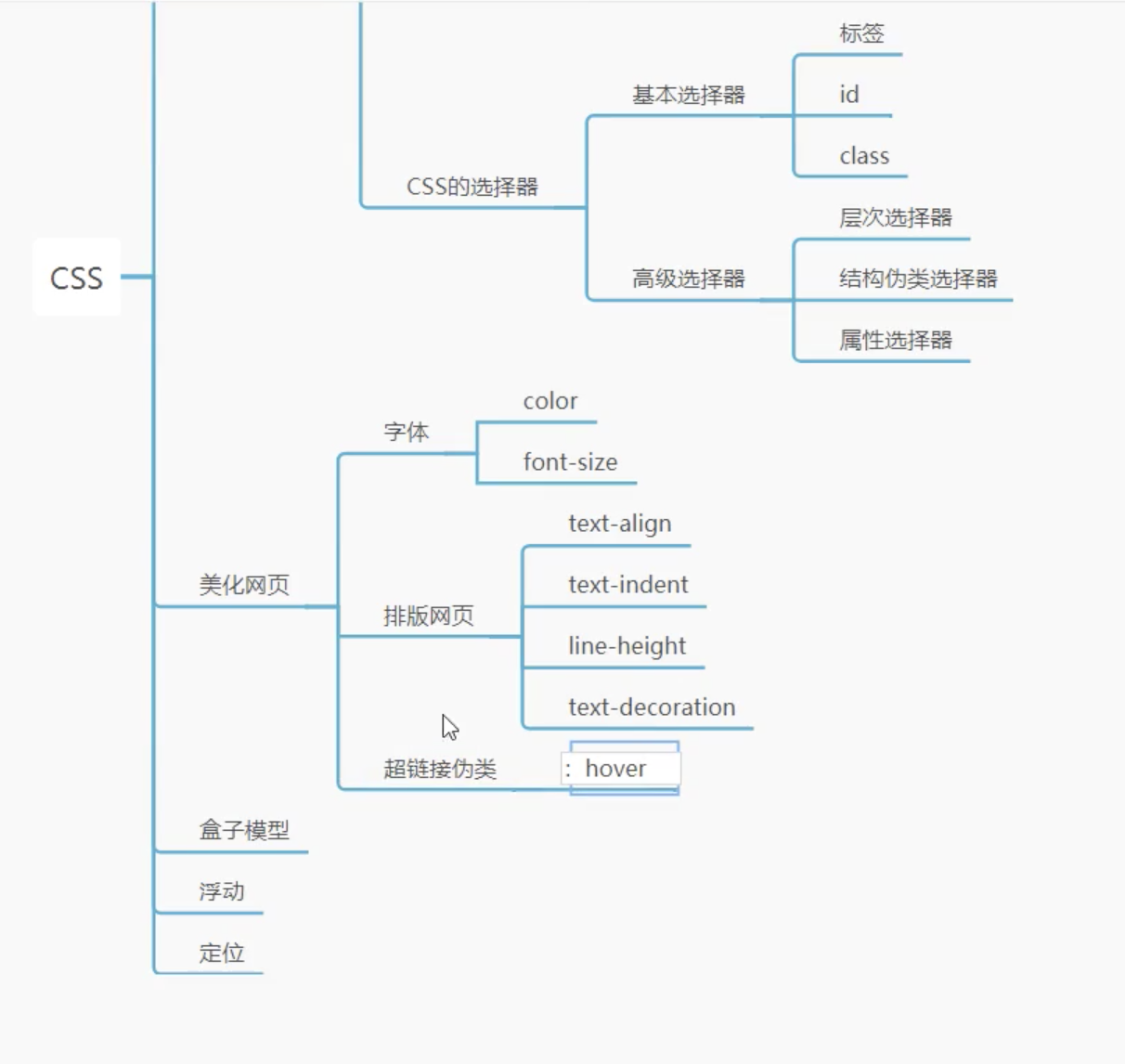
CSS选择器(重点+难点) 美化网页(文字,阴影,超链接,列表,渐变)
盒子模型
浮动,定位
网页动画(特效)
门户网站,模版之家,源码之家
什么是CSS Cascading Style Sheet 层叠及联样式表
CSS:表现(美化网页)
字体:颜色,边距,高度,宽度,背景图片,网页定位,浮动…
发展史 CSS1.0
CSS2.0 DIV (块)+CSS,HTML与CSS结构分离的思想,网页变得简单,SEO
CSS2.1 浮动,定位
CSS3.0 圆角,阴影,动画,浏览器兼容性~
快速入门 style
1
2
3
4
5
6
7
8
9
10
11
12
13
14
15
16
17
18
19
20
21
22
23
24
25
26
<!DOCTYPE html > <html lang ="en" > <head > <meta charset ="UTF-8" > <title > Title</title > <style > h1{ color: red; } </style > </head > <body > <h1 > 我是标题</h1 > </body > </html >
建议使用这种方式:
css的优势:
内容和表现分离
网页结构表现统一,可以实现复用
样式十分的丰富
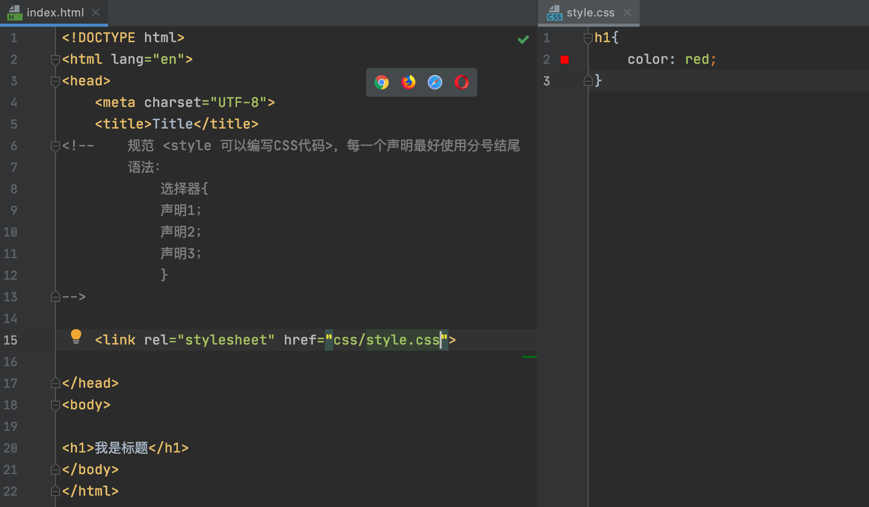
建议使用独立于html的css文件
利于SEO,容易被搜索引擎收录
CSS的三种导入样式 1 2 3 4 5 6 7 8 9 10 11 12 13 14 15 16 17 18 19 20 21 22 23 24 25 26 27 28 29 30 31 <!DOCTYPE html > <html lang ="en" > <head > <meta charset ="UTF-8" > <title > Title</title > <style > h1{ color: green; } </style > <link rel ="stylesheet" href ="css/style.css" > </head > <body > <h1 > hello</h1 > </body > </html >
拓展:外部样式两种写法 (不需要严格掌握)
1 2 <link rel ="stylesheet" href ="css/style.css" >
1 2 3 4 <style > @import url("css/style.css" ); </style >
link 和 import语法结构不同,前者<link> 是html标签,只能放入html源代码中使用,后者可以看作CSS样式,作用是引用CSS样式功能,import在html使用的时候需要<style type=”text/css”>标签,同时可以直接@import url(css文件地址)
选择器 作用:选择页面上的某一个或者某一类的元素
基本选择器
类选择器:选择一类标签 标签.{}
1 2 3 4 5 6 7 8 9 10 11 12 13 14 15 16 17 18 19 20 21 22 23 24 25 26 27 28 <!DOCTYPE html > <html lang ="en" > <head > <meta charset ="UTF-8" > <title > Title</title > <style > /*类选择器的格式* .class的名称{}/ 好处,可以多个标签归类,是同一个class 可以复用 */ .yuxuan { color: aqua; } .loner { color: red; } </style > </head > <body > <h1 class ="yuxuan" > 标题1</h1 > <h1 class ="loner" > 标题2</h1 > <h1 class ="yuxuan" > 标题3</h1 > <p class ="yuxuan" > p 段落</p > </body > </html >
标签选择器 class:选择所有class属性一直的标签,跨标签 .类名
1 2 3 4 5 6 7 8 9 10 11 12 13 14 15 16 17 18 19 20 21 22 23 24 25 26 <!DOCTYPE html > <html lang ="en" > <head > <meta charset ="UTF-8" > <title > Title</title > <style > h1{ color: red; background: wheat; border-radius: 24px; } p{ font-size: 80px; } </style > </head > <body > <h1 > hello world!</h1 > <h1 > hello world!</h1 > <p > 听我说</p > </body > </html >
ID 选择器:全局唯一 #id名{}
1
2
3
4
5
6
7
8
9
10
11
12
13
14
15
16
17
18
19
20
21
22
23
24
25
26
27
28
29
30
31
<!DOCTYPE html > <html lang ="en" > <head > <meta charset ="UTF-8" > <title > Title</title > <style > /* id 选择器: id 必须保证全局唯一 #id 名称{} 不遵循就近原则,固定的 ID选择器>class 选择器>标签选择器 */ #yuxuan { color: red; } .style1 { color: green; } h1{ color :blue ; } </style > </head > <body > <h1 class ="style1" id ="yuxuan" > 标题1</h1 > <h1 class ="style1" > 标题2</h1 > <h1 class ="style1" > 标题3</h1 > <h1 > 标题4</h1 > <h1 > 标题5</h1 > </body > </html >
优先级: id > class > 标签
层次选择器
分类
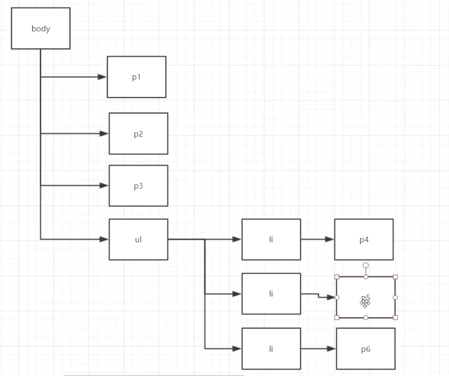
后代选择器:在某个元素的后面 爷爷-爸爸-你
1 2 3 4 body p { background : red; }
子选择器,一代,儿子
1 2 3 4 body >p { background : blue; }
相邻兄弟选择器
1 2 3 4 .active +p { background : brown; }
通用选择器
1 2 3 4 .active ~p {background : green;}
结构伪类选择器 伪类: 条件
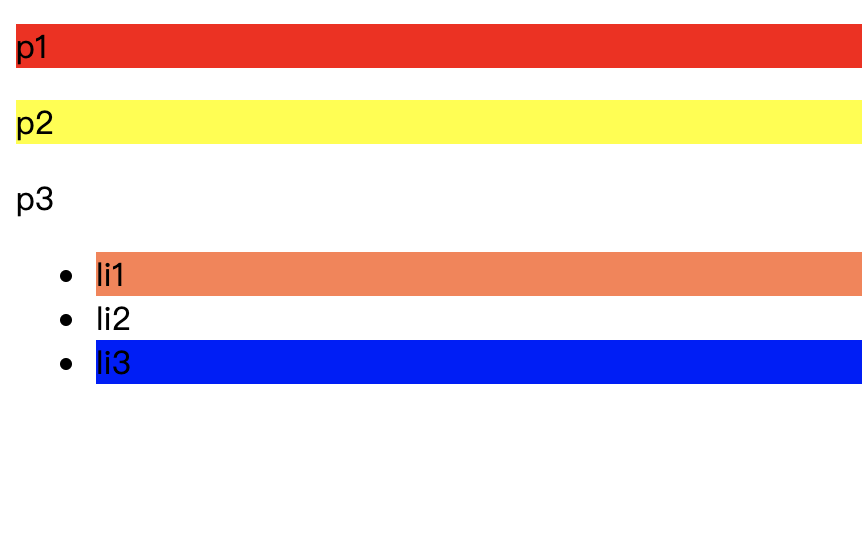
1 2 3 4 5 6 7 8 9 10 11 12 13 14 15 16 17 18 19 20 21 22 23 24 25 26 ul li :first-child { background : coral; } ul li :last-child { background : blue; } p :nth-child(1) { background : red; } p :nth-of-type(2) { background : yellow; } a :hover { background : black; }
1 2 3 4 5 6 7 8 9 10 11 12 13 14 15 16 17 18 19 20 21 22 23 24 25 26 27 28 29 30 31 32 33 34 35 36 37 38 39 40 41 42 43 44 45 46 47 48 49 <!DOCTYPE html > <html lang ="en" > <head > <meta charset ="UTF-8" > <title > Title</title > <style > /* ul的第一个子元素 ul的最后一个子元素 */ ul li :first-child { background: coral; } ul li :last-child { background: blue; } /* 选中p1: 定位到父元素,选择当前的第一个元素 选择当前p元素的父级元素,选中父级元素的第一个,并且是当前元素才生效!,顺序 */ p :nth-child(1) { background: red; } p :nth-of-type(2) { background: yellow; } </style > </head > <body > <p > p1</p > <p > p2</p > <p > p3</p > <ul > <li > li1</li > <li > li2</li > <li > li3</li > </ul > </body > </html >
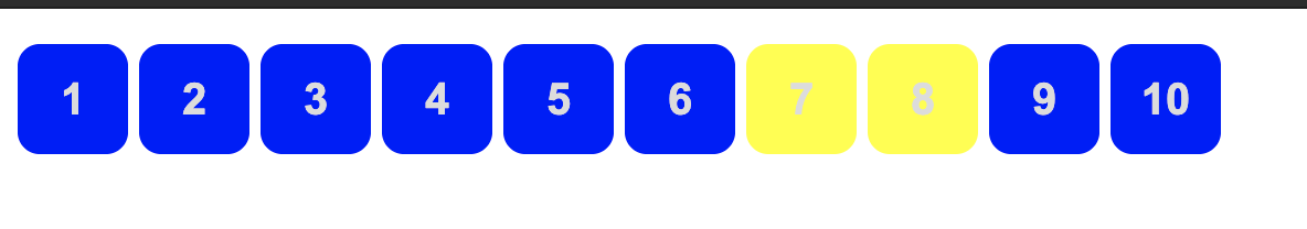
属性选择器(常用) id+class的结合~
1 2 3 4 5 6 7 8 9 10 11 12 13 14 15 16 17 18 19 20 21 22 23 24 25 26 27 28 29 30 31 32 33 34 35 36 37 38 39 40 41 42 43 44 45 46 47 48 49 50 51 52 53 54 55 56 57 58 59 60 61 62 63 64 65 66 67 68 69 70 71 <!DOCTYPE html > <html lang ="en" > <head > <meta charset ="UTF-8" > <title > Title</title > <style > .demo a { float: left; display: block; height: 50px; width: 50px; border-radius: 10px; background: blue; text-align: center; color: gainsboro; text-decoration: none; margin-right: 5px; font : bold 20px /50px Arial ; } /* 属性名. 属性名=属性值 (可以使用正则表达式) = 绝对等于 *= 包含这个元素 ^= 以这个开头 $= 以这个结尾 */ a [href$=pdf] { background: yellow; } </style > </head > <body > <p class ="demo" > <a href ="http://www.baidu.com" class ="links item first" id ="first" > 1</a > <a href ="http://yuxuan" class ="links item active" target ="_blank" title ="test" > 2</a > <a href ="images/123.html" class ="links item" > 3</a > <a href ="images/123.png" class ="links item" > 4</a > <a href ="images/123.jpg" class ="links item" > 5</a > <a href ="abc" class ="links item" > 6</a > <a href ="/a.pdf" class ="links item" > 7</a > <a href ="/abc.pdf" class ="links item" > 8</a > <a href ="abc.doc" class ="links item" > 9</a > <a href ="adcd.doc" class ="links item last" > 10</a > </p > </body > </html >
效果图
正则表达式的通配符
美化网页元素 为什么要美化网页
有效的传递页面的信息
美化网页,页面漂亮,才能吸引用户
凸显页面的主题
提高用户的体验
span标签:重点要突出的字,使用span标签套起来
1 2 3 4 5 6 7 8 9 10 11 12 13 14 15 16 17 18 19 20 <!DOCTYPE html > <html lang ="en" > <head > <meta charset ="UTF-8" > <title > Title</title > <style > #title1 { font-size: 90px; } </style > </head > <body > 欢迎学习 <span id ="title1" > Java</span > </body > </html >
字体样式 1 2 3 4 5 6 7 8 9 10 11 12 13 14 15 16 17 18 19 20 <style > body{ font-family: 微软雅黑,'Tahoma'; color: brown; } h1{ font-size: 50px; } .p1 { font-weight: bold; } </style >
文本样式
颜色 color rib /rgba
文本的对齐方式 text-align = center 首行缩进 text-indent:2em 行高 line-heigh: 单行文字,上下剧中! Line-height =height 装饰 text_decoration
文本图片水平对齐:vertical-line middle
1 2 3 4 5 6 7 8 9 10 11 12 13 14 15 16 17 18 19 20 21 22 23 24 25 26 27 28 29 30 31 32 33 34 35 36 37 38 39 40 41 42 43 44 45 46 47 48 49 50 51 52 53 54 55 56 57 58 59 60 61 62 63 64 65 66 67 68 69 70 71 72 73 74 75 76 77 78 <!DOCTYPE html > <html lang ="en" > <head > <meta charset ="UTF-8" > <title > Title</title > <style > body{ font-family: 微软雅黑,'Tahoma'; color: brown; } h1{ color: rgba(0,255,255,0.9); text-align: center; } .p1 { font-weight: bold; text-indent: 2em; } .p3 { background: blue; height: 300px; line-height: 300px; } .l1 { text-decoration: underline; } .l2 { text-decoration: line-through; } .l3 { text-decoration: overline; } a{ text-decoration: none; } img,span{ vertical-align: middle; } </style > </head > <body > <a href ="" > 123331232131231232112312312312312312321312213</a > <p class ="l1" > 1232131</p > <p class ="l2" > 1232131</p > <p class ="l3" > 1232131</p > <h1 > 字义编辑</h1 > <p class ="p1" > 跬(kuǐ):半步,古时称人行走, 举足一次为跬, 举足两次为步, 故半步叫“跬”故不积跬步,无以至千里;不积小流,无以成江海故不积跬步,无以至千里;不积小流,无以成江海故不积跬步,无以至千里;不积小流,无以成江海故不积跬步,无以至千里;不积小流,无以成江海故不积跬步,无以至千里;不积小流,无以成江海 。</p > <p > 故不积跬步,无以至千里;不积小流,无以成江海。</p > <p class ="p3" > Download any RNAseq datasets for an experiment. You can use your own data or find one of interest from NCBI GEO (https://www.ncbi.nlm.nih.gov/geo/ ). You must identify a dataset comparing at least two conditions (you may use the example shown in class), and align these to the appropriate reference genome. Perform basic data quality assessment using FastQC or other software, trim data if necessary. </p > <img src ="images/nba.jpg" alt ="" > asddsfsdfdsfs </p > </body > </html
阴影
1 2 3 4 5 #price { text-shadow : wheat 10px 0px 10px ; }
超链接伪类 正常情况下a, a:hover
1 2 3 4 5 6 7 8 9 10 11 12 13 14 15 16 a { text-decoration : none; color : black; } a :hover { color : orange; } a :active { color : green; } a :visited { color :blue; }
列表 1 2 3 4 5 6 7 8 9 10 11 12 13 14 15 16 17 ul { background : #a0a0a0 ; } ul li { height : 30px ; list-style : none; text-indent : 1em ; }
完整的css代码
1 2 3 4 5 6 7 8 9 10 11 12 13 14 15 16 17 18 19 20 21 22 23 24 25 26 27 28 29 30 31 32 33 34 35 36 37 38 39 40 41 #nav { width : 300px ; background : #a0a0a0 ; } .title { font-size : 18px ; font-weight : bold; text-indent : 1em ; line-height : 35px ; background : red; } ul { background : #a0a0a0 ; } ul li { height : 30px ; list-style : none; text-indent : 1em ; } a { text-decoration : none; font-size : 14px ; color : black; } a :hover { color : orange; }
背景 背景颜色
背景图片
1 2 3 4 5 6 7 8 9 10 11 12 13 14 15 16 17 18 19 20 21 22 23 24 25 26 27 28 29 30 31 32 33 34 <!DOCTYPE html > <html lang ="en" > <head > <meta charset ="UTF-8" > <title > Title</title > <style > div{ width: 1000px; height: 700px; border: 1px solid red; background-image : url ("images /nba .jpg "); } .div1 { background-repeat: repeat-x; } .div2 { background-repeat: repeat-y; } .div3 { background-repeat: no-repeat; } </style > </head > <body > <div class ="div1" > </div > <div class ="div2" > </div > <div class ="div3" > </div > </body > </html >
渐变 1 2 background-color : #4158D0 ;background-image : linear-gradient (25deg , #4158D0 0%, #C850C0 46%, #FFCC70 100%);
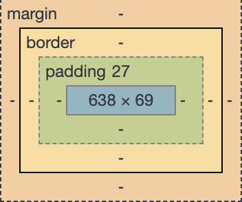
盒子模型 什么是盒子模型
margin:外边距
padding: 内边距
border:边框
边框
边框的粗细
边框的样式
边框的颜色
1 2 3 4 5 6 7 8 9 10 11 12 13 14 15 16 17 18 19 20 21 22 23 24 25 26 27 28 29 30 31 32 33 34 35 36 37 38 39 40 41 42 43 44 45 46 47 48 49 50 51 52 53 54 55 56 57 58 59 60 61 <!DOCTYPE html > <html lang="en"> <head > <meta charset="UTF-8"> <title >Title </title > <style > #box { width : 300px ; border : 1px solid red; } h2 { font-size : 16px ; background-color : #3cdba6 ; line-height : 30px ; color : white; } form { background : #3cdba6 ; } div :nth-of-type(1) input { border : 3px solid black; } div :nth-of-type(2) input { border : 3px dashed #77ff00 ; } </style > </head > <body > <div id="box"> <h2 >会员登陆</h2 > <form action="#"> <div > <span >用户名:</span > <input type="text"> </div > <div > <span >密码:</span > <input type="text"> </div > <div > <span >邮箱:</span > <input type="text"> </div > </form > </div > </body > </html >
内外边距 1 2 3 4 5 6 7 8 9 10 11 12 13 14 15 16 17 18 19 20 21 22 23 24 25 26 27 28 29 30 31 32 33 34 35 36 37 38 39 40 41 42 43 44 45 46 47 48 49 50 51 52 53 54 55 56 <!DOCTYPE html > <html lang ="en" > <head > <meta charset ="UTF-8" > <title > Title</title > <style > #box { width: 300px; border: 1px solid red; margin: 0 auto ; } h2{ font-size: 16px; background-color : #3cdba6 ; line-height: 30px; color: white; margin-top: 0; } form{ background : #3cdba6 ; } input{ border: 1px solid black; } </style > </head > <body > <div id ="box" > <h2 > 会员登陆</h2 > <form action ="#" > <div > <span > 用户名:</span > <input type ="text" > </div > <div > <span > 密码:</span > <input type ="text" > </div > <div > <span > 邮箱:</span > <input type ="text" > </div > </form > </div > </body > </html >
盒子的计算方式:你这个元素到底多大?
margin+border+padding + 内容宽度 (合理的规范)
圆角边框 4个角
1 2 3 4 5 6 7 8 <style > div{ width: 100px; height: 100px; border: 10px solid red ; } </style >
阴影 1 2 3 4 5 6 7 8 9 10 11 12 13 14 15 16 17 18 19 20 21 22 <!DOCTYPE html > <html lang ="en" > <head > <meta charset ="UTF-8" > <title > Title</title > <style > div{ width: 100px; height: 100px; border: 10px solid red ; box-shadow: 10px 10px 1px yellow; } </style > </head > <body > <div > </div > </body > </html >
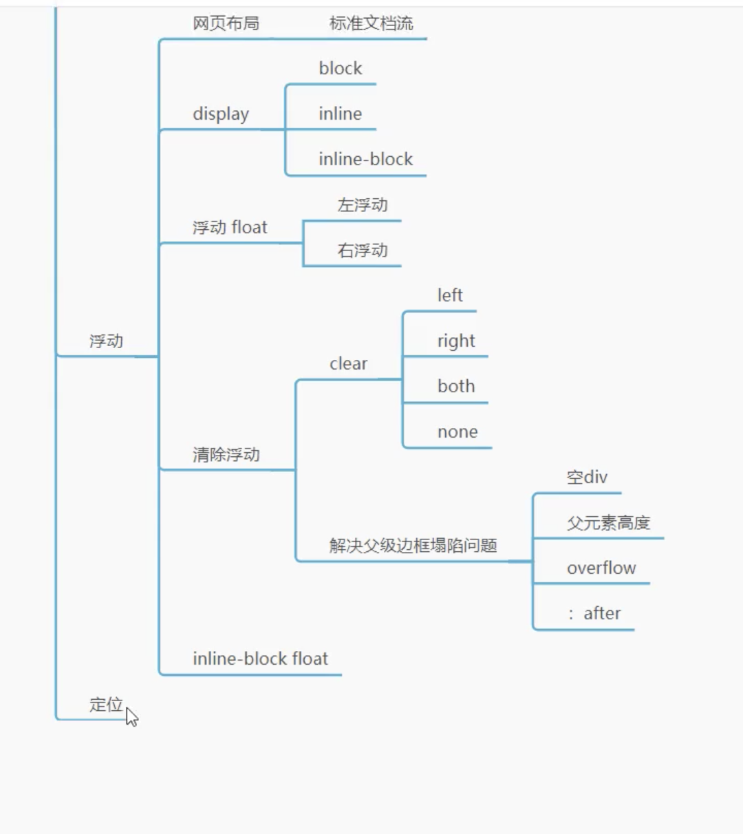
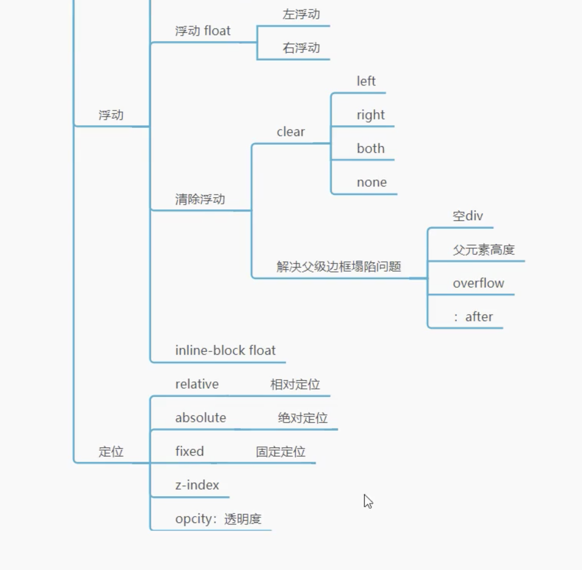
浮动 标准文档流
块级元素:独占一行
行内元素:不独占一行
行内元素可以被包含在块级元素中,反之则不可以
Display 1 2 3 4 5 6 7 8 9 10 11 12 13 14 15 16 17 18 19 20 21 22 <style > div { width: 100px; height: 100px; border: 1px solid red; display: inline; } span{ width :100px ; height :100px ; border: 1px solid red; display: inline-block; } </style >
这个也是一种实现行内元素排列的方式,但是我们很多情况下都使用float
float
左右浮动
父级元素边框塌陷的问题 1 2 3 clear : right ; 右侧不允许有自由浮动的元素clear : left ; 左侧不允许有自由浮动的元素clear : both ; 两侧不允许有自由浮动的元素
解决方案:
增加父级元素的高度~
1 2 3 4 #father { border :1px #000 solid height: 800px ; }
增加一个空的div标签,清除浮动
1 2 3 4 5 6 7 <div class="clear"></div> .clear { clear :both; margin :0 ; padding :0 ; }
overflow
在父级元素中增加一个overflow: hidden;
1 2 3 4 5 6 7 8 9 10 11 12 13 14 15 16 17 18 19 20 21 22 23 24 25 26 27 28 29 <!DOCTYPE html > <html lang ="en" > <head > <meta charset ="UTF-8" > <title > Title</title > <style > #content { width: 200px; height: 150px; overflow: scroll; } </style > </head > <body > <div id ="content" > <img src ="images/up.jpeg" alt ="" > <p > 下午两点整:注射新冠疫苗第一针。胳膊有点痛。 下午两点半:留观室观察半小时,除胳膊痛无其他反应。 傍晚时分: 觉得有点腰酸背痛,当时不以为意以为是工作久坐的缘故。 </p > </div > </body > </html >
父类添加一个伪类:after
1 2 3 4 5 #father : after { content : '' ; display : block; clear :both; }
小结:
浮动元素后面添加空div
简单,代码中尽量避免空的div
设置父元素的高度
简单,父元素假设又了固定的高度,就会被限制
overflow
简单,下拉的一些场景避免使用
父类添加一个伪类:after(推荐)
写法稍微复杂一点,但是没有副作用,推荐使用
对比(display&float)
相同点: 让元素排在一类
定位 相对定位 1 2 3 4 5 6 7 8 9 10 11 12 13 14 15 16 17 18 19 20 21 22 23 24 25 26 27 28 29 30 31 32 33 34 35 36 37 38 39 40 41 42 43 44 45 46 47 48 49 50 51 52 53 54 55 56 <!DOCTYPE html > <html lang ="en" > <head > <meta charset ="UTF-8" > <title > Title</title > <style > body{ padding: 20px; } div{ margin: 10px; padding: 5px; font-size: 12px; line-height: 25px; } #father { border : 1px solid #666 ; } #first { background-color : #3cdba6 ; border: 1px dashed gainsboro; position : relative ; top: -20px; } #second { background-color : #3cdb99 ; border: 1px dashed red; position : relative ; left : 20px ; } #third { background-color : #3cdb22 ; border: 1px dashed yellow; position: relative; bottom: 20px; } </style > </head > <body > <div id ="father" > <div id ="first" > 第一个盒子</div > <div id ="second" > 第二个盒子</div > <div id ="third" > 第三个盒子</div > </div > </body > </html >
相对定位:position: relative
相对于原来的位置,进行指定的偏移,相对定位的话,它任然在标准文档流中,原来的位置会被保留
1 2 3 4 top : -20px ;left : 20px ; bottom : -20px ;right :20px
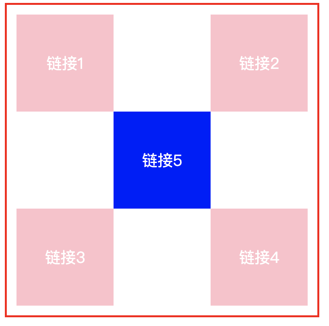
练习
效果图:
1 2 3 4 5 6 7 8 9 10 11 12 13 14 15 16 17 18 19 20 21 22 23 24 25 26 27 28 29 30 31 32 33 34 35 36 37 38 39 40 41 42 43 44 45 46 47 48 49 50 51 <!DOCTYPE html > <html lang ="en" > <head > <meta charset ="UTF-8" > <title > Title</title > <style > #box { width: 300px; height: 300px; border: 2px solid red; padding: 10px; } a{ width: 100px; height: 100px; text-decoration: none; background: pink; line-height: 100px; text-align: center; color: white; display: block; } a :hover { background: blue; } .a2 ,.a4 { position: relative; left: 200px; top: -100px; } .a5 { position: relative; left: 100px; top: -300px; } </style > </head > <body > <div id ="box" > <a class ="a1" href ="#" > 链接1</a > <a class ="a2" href ="#" > 链接2</a > <a class ="a3" href ="#" > 链接3</a > <a class ="a4" href ="#" > 链接4</a > <a class ="a5" href ="#" > 链接5</a > </div > </body > </html >
绝对定位 定位:基于xxx定位,上下左右
没有父级元素定位的前提下,相对于浏览器定位
假设父级元素存在定位,我们通常会相对于父级元素进行偏移
在父级元素范围内移动
相对于父级或者浏览器的位置,进行指定的偏移,绝对定位的话,他不在标准文档流中,原来的位置不会被保留
1 2 3 4 5 6 7 8 9 10 11 12 13 14 15 16 17 18 19 20 21 22 23 24 25 26 27 28 29 30 31 32 33 34 35 36 37 38 39 40 41 42 43 44 45 46 47 48 49 50 51 52 53 54 55 56 57 58 <!DOCTYPE html > <html lang ="en" > <head > <meta charset ="UTF-8" > <title > Title</title > <style > body{ padding: 20px; } div{ margin: 10px; padding: 5px; font-size: 12px; line-height: 25px; } #father { border : 1px solid #666 ; padding: 0; position: relative; } #first { background-color : #3cdba6 ; border: 1px dashed gainsboro; position: absolute; top: -20px; } #second { background-color : #3cdb99 ; border: 1px dashed red; position : relative ; left : 20px ; } #third { background-color : #3cdb22 ; border: 1px dashed yellow; position: relative; bottom: 20px; } </style > </head > <body > <div id ="father" > <div id ="first" > 第一个盒子</div > <div id ="second" > 第二个盒子</div > <div id ="third" > 第三个盒子</div > </div > </body > </html >
固定定位(fixed) 1 2 3 4 5 6 7 8 9 10 11 12 13 14 15 16 17 18 19 20 21 22 23 24 25 26 27 28 29 30 31 32 33 34 <!DOCTYPE html > <html lang ="en" > <head > <meta charset ="UTF-8" > <title > Title</title > <style > body{ height: 1000px; } div :nth-of-type(1) { width: 100px; height: 100px; background: red; position: absolute; right: 0; bottom: 0; } div :nth-of-type(2) { width: 50px; height: 50px; background: yellow; position: fixed; right: 0; bottom: 0; } </style > </head > <body > <div > div1</div > <div > div2</div > </body > </html >
z-index 图层的概念
Z-index: 默认是0,最高无限
1 2 3 4 5 6 7 8 9 10 11 12 13 14 15 16 17 18 19 20 21 22 23 24 25 26 27 28 29 30 31 32 33 #content { padding : 0px ; margin : 0px ; overflow : hidden; font-size : 12px ; line-height : 25px ; border : 1px #000 solid; width : 380px ; } ul ,li { padding : 0px ; margin : 0px ; list-style : none; } #content ul { position : relative; } .tipText ,.tipBg { position : absolute; width : 380px ; height : 25px ; top : 204px ; } .tipBg { background : black; opacity : 0.5 ; } .tipText { z-index : 999 ; color : white; }
总结