作为一位牛油果资深爱好者,苦于牛油果价格实在太贵,Sam 店一个品相俱佳的大果要8块钱,鲜果一号之类等其他精品水果店居然有的要卖到10+一个,还是中果,硬邦邦,不怎么好吃的那种,简直黑心。
同时呢,作为一位申请美帝研究生的大四狗,我严肃认真地要把牛油果价格因素纳入到我选择的范围内。同时,我真的很好奇,美帝牛油果的价格是咋样的。当然最重要的是要完成当前303大数据作业🧐,因为report有点写不出来,就先发个专栏整理整理思路。

以下分析以及可视化,借鉴了之前大神们的分析:(他们做的图真的好好看啊!)
https://www.kaggle.com/janiobachmann/price-of-avocados-pattern-recognition-analysis
但是他们的数据集是从2015-2018,已经有一些年份了,不能如实反应当今市场,尤其是新冠后的影响。碰巧有大神更新了数据集,在原有的基础上新增到2020.5月的牛油果数据。利用前人经验,做未来预测分析
https://www.kaggle.com/timmate/avocado-prices-2020
注:本篇所有分析预测都在r上完成,95%借助ggplot2,yysy,r做图真的好看。预测部分,偷了点懒,直接用的是Facebook开发的prophet包,因为之前没有接触过时间相关的预测,LSTM目前还没有学到家,但ddl在前,等有空再用python补上。
下载并读取
1 | df <- read.csv("/Users/yuxuan/Desktop/INT301-Avocado-prediction/avocado-updated-2020.csv") |
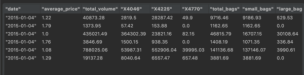
其中以下是我们这次的实验对象 - date - 观察的时间 - average_price - 每一个牛油果的平均价格 - total_volume - 当日售出了多少牛油果 - year - 年份(Date格式) - type - 种类,是有机的还是普通的 - geography - 数据来源的地区
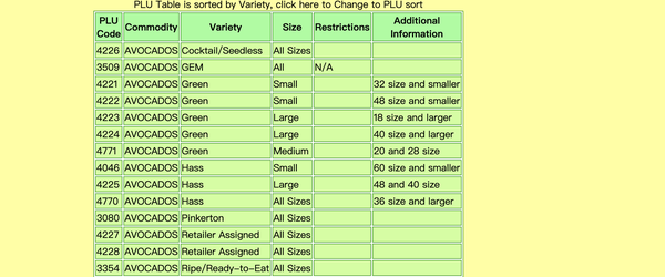
至于X4046,X4225,X4770代表的是牛油果的种类(PLU code)都是Hass 牛油果,只是大小有区别
检查是否存在缺失(missing value)
1 | sum(is.na(df)) |
发现数据集无缺失值
根据种类做density plot
1 | library(ggplot2) |
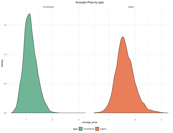
图中可以发现
- 普通的牛油果(绿色)大部分集中在1$ 附近,形状也比较高瘦,值域区间相比之下也比较小
- 但有机的牛油果(红色)则显得更加敦实,值域也宽,最贵的居然要卖到3$
量化具体的一些比率
1 | library(dplyr) |
| Type | Average Volume | Average Price | Volume percent |
|---|---|---|---|
| Conventional | 1,818,206 (1.8 M) | 1.16 $ | 96.8% |
| Organic | 60,127 (0.06 M) | 1.62 $ | 3.2% |
从表格中我们可以发现
- 销售的普通牛油果在市场以均价1.16$(7.58¥)占比居然高达97%
- 相比之下有机牛油果1.62$ (10.58¥) 市场占比大概只有3%
2015-2020间普通和有机牛油果的价格波动曲线
1 | df$date <- as.Date(df$date, "%Y-%m-%d") |
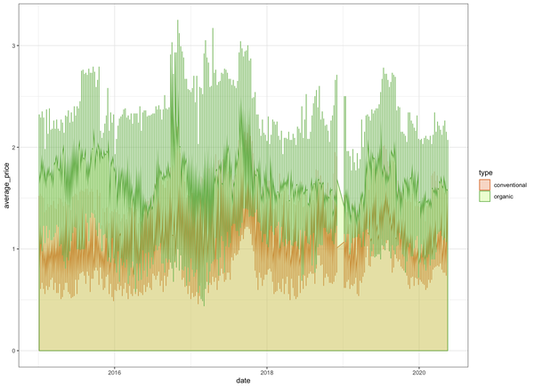
1 | ggplot(data=df, aes(x=date, y=average_price,col=type))+ |
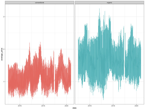
- 有机的价格永远要高于普通的
- 价格呈现某种季节性的波动,符合水果季节性波动的常识
- 是否和销售的量呈现关联,下文探索
2015-2020年间的牛油果总的价格分布
1 | ggplot(seasonal_df,aes(x=average_price,fill=as.factor(year)))+ |
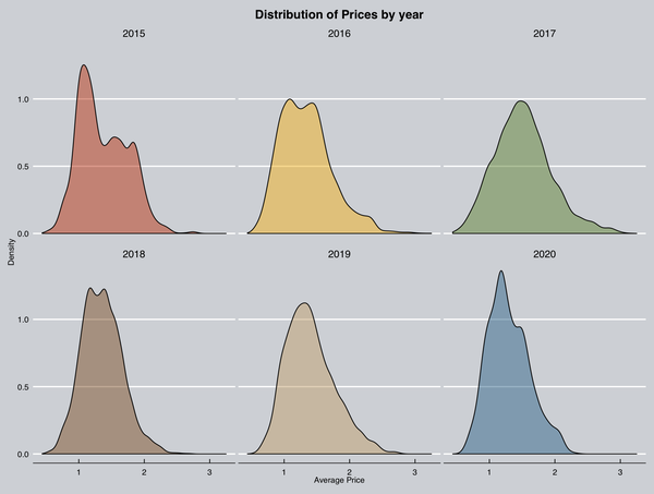
- 6年间的价格分布,其中2017年最成正态分布的形状,高端和低端牛油果都在市场分一杯羹
价格波动曲线和牛油果售卖的量关系
1 | library(ggplot2) |
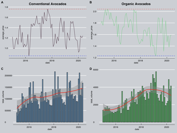
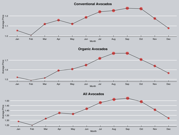
- 为了找到季节性规律(seasonal patterns)我将平均售价和销售量以月为单位进行统计分析
- A,B图代表的都是以月为单位的平均销售价格(monthly),蓝线代表最小值(min)红线代表最大值(max)
- 普通牛油果最贵的一个月也就1.8$,最便宜的一个月0.82$;有机的最贵要2.1$,最便宜的也要1.21$
- C,D代表的是以月为单位的销量,红线代表的是趋势
- 美帝人民对牛油果的爱是一贯的,销量呈逐年上升的趋势,这里指的是普通牛油果
- 19-20年,可能由于经济形势下滑以及20年后的新冠疫情,对有机牛油果的需求减少,未能像普通牛油果一样持续增长
- 月销量也呈现某种季节性规律,需要接下来的仔细分析
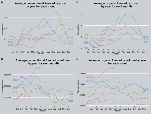
2015-2020年间以月为单位比较销量和价格
1 | ## Process the data into year and month format |
1 | options(repr.plot.width=10,repr.plot.height=8) |
1 | conv_patterns_vol <- seasonal_df %>% select(monthabb,total_volume,type) %>% filter(type=="conventional") %>% group_by(monthabb) %>% summarise(avg=mean(total_volume)) %>% |
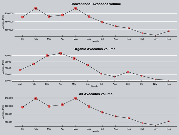
- 综合来说,每年的9,10 月份牛油果的平均价格会达到一年中的最高值,2月达到一年的最低值
- 对于销量来说,美国人喜欢在2月和5月购买牛油果,11月份买牛油果的意愿最低
- 查资料可得,牛油果一般在8,9月份成熟收获,加上采摘,包装和运输时间所以会有一定的延迟,可以看见图中的八月都是呈现上升趋势。
- 可以发现销售量和价格呈现一定的负相关,这符合我们的常识,人们喜欢在价格低的时候购买,而一样水果或者蔬菜则会在刚上市时价格逐步上升,达到最高,然后再下降
- 为什么随着采摘供应和价格会成一定的正相关?我的猜测是,就像苏州人说的“时鲜货”,刚刚摘下的牛油果肯定是又大又好有新鲜,而且前一年的量已经消耗的差不多了,所以价格会有一阵子的上涨,然后下探,符合图中的趋势走向
- 也可以清晰的看见,销量的确是逐年增加的,大概率是网红不遗余力的宣传,将牛油果作为健康活力,fashion的代名词。这路子的确是正确的,因为美国人民消耗的牛油果总的来说逐年递增
2015-2020 以季节为单位分析牛油果价格和销量
1 | options(repr.plot.width=10,repr.plot.height=8) |
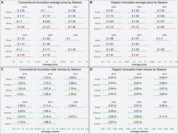
- 春(3-5),夏(6-8),秋(9-11),冬(12-2)
- A,B 代表的是牛油果的平均价格,以有机和非有机划分;C,D 代表的则是销量,同样以有机和非有机划分,m代表million百万
- 总的来说,春冬季买牛油果比较划算,均价最低,同样也反应在了销量上,春夏销量最高,因为牛油果自从8,9月份成熟以后已经大量充斥了市场,所以价格会比较低,吸引较多的买家,直到下一批牛油果的成熟
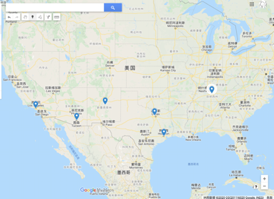
牛油果价格和城市的关系
1 | library(forcats) |
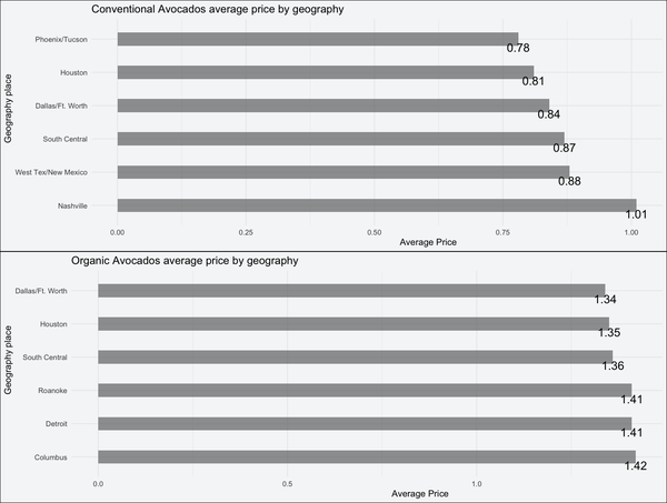
- 通过计算返回前六低的地区和城市
- 以非有机为例:菲尼克斯(凤凰城),休斯顿,达拉斯,中南部城市群,新墨西哥洲,Nashville(靠近印第安纳洲)
- 通过地图查询,前五个都在美国的中西部,靠近墨西哥
- 通过查询,牛油果原产地墨西哥,美国价格最低的前5个城市很有可能是种植牛油果的基地,所以牛油果价格便宜
- 维基百科上说之前加州和佛罗里达是牛油果的主产地,但随着水资源的价格上涨,牛油果产地发生了写偏移,我合理怀疑是向着上述地点前一,前五个城市,大致都分布在同一个纬度上
- 下面的链接说的是美国现阶段牛油果种植地方,提到了圣安东尼奥,也是中西部的城市,毗邻休斯顿,达拉斯,因为气候很像墨西哥,适合牛油果种植,并且淡水相对便宜
- 这里我用Google map将上述六个城市给标注出来了,的确是近似处于同一纬度,牛油果前五便宜的城市的确靠近墨西哥
牛油果价格预测和走势图
1 | library(prophet) |
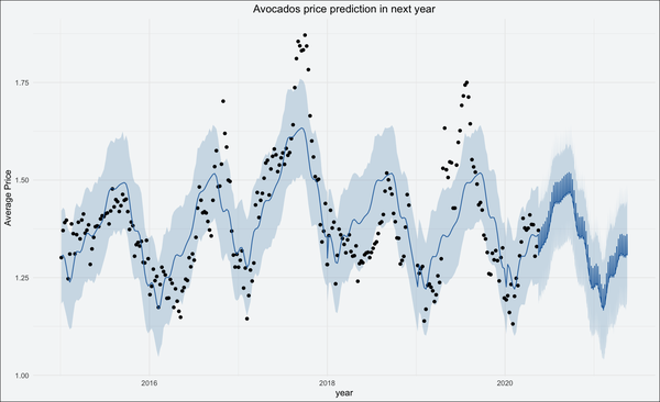
- 利用Facebook开发的prophet包进行时间序列上的价格预测
- 可以看见价格还是会呈现一个季节性波动,但是价格可能会走低
- 联系到当前新冠疫情在美国的疯狂爆发,牛油果销量下滑是必然的,走势向下也符合预期
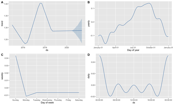
- prophet包自带的功能,可以根据时间,细化到每一天以小时为单位的时间预测
- A图是以年为单位的分析预测:从15年开始,牛油果的价格一直保持正增长,17年是疯狂的一年,以高于1.30的幅度快速增长,这也应和了我的个人感受,因为我就是17年才知道这种水果,也就是说网红公司在这一年大幅度的疯狂宣传这款水果,然后在价格上炒的越来愈高。18年后价格增速趋于稳定,稳定在每年1.28左右增长;至于未来的一年,prophet也给出了自己的预测,区间大概在[1.20-1.34]。考虑到北美新冠疫情的影响,我觉得很有可能会以1.20左右,但仍然是正增长,据我在推特上观察,北美千禧年一代对牛油果仍然是非常非常喜欢,各种可爱有趣的漫画是层出不穷。我相信2020年牛油果的价格仍然上涨,只是增速放缓
- B图是以月为单位的分析,可以看见在5月份,价格转为正增长,持续到10月份,价格达到峰值,随后价格开始下跌,到来年的2月份达到低点,符合之前的分析
- C图是以每周为单位分析,牛油果在周末价格最高,符合美国家庭周末在周末进行大采购的习惯,所以那两天,价格也最高
- D图是以每天来分析,没有参考意义,因为我的数据集就没有这个带小时为单位的时间
完整版的代码请在GitHub下载
- Post title:2015-2020 美国市场牛油果价格分析和预测
- Post author:Yuxuan Wu
- Create time:2021-01-25 08:57:06
- Post link:yuxuanwu17.github.io2021/01/25/2015-2020-美国市场牛油果价格分析和预测/
- Copyright Notice:All articles in this blog are licensed under BY-NC-SA unless stating additionally.